
A financial health analysis is a structured diagnostic that measures a company's ability to generate cash, meet obligations, and sustain profitability over time. The fastest way to start: pull your last three income statements, balance sheets, and cash flow statements, then compute four numbers — operating cash flow, free cash flow, current ratio, and net profit margin. Those four tell you more in 15 minutes than most people learn in an hour of reading.
Quick triage checklist (run in 15–30 minutes):
- Gather three years of financial statements (10-K or annual reports, or accounting system exports)
- Compute net working capital = Current Assets minus Current Liabilities
- Compute free cash flow = Operating Cash Flow minus Capital Expenditures
- Compute current ratio = Current Assets divided by Current Liabilities
- Compute net profit margin = Net Income divided by Revenue
Micro scorecard for immediate triage:
| Metric | Green | Amber | Red |
|---|---|---|---|
| Current ratio | Above 2.0 | 1.0–2.0 | Below 1.0 |
| Free cash flow | Positive and growing | Positive but flat | Negative |
| Net profit margin | Above 10% | 3%–10% | Below 3% |
| Debt-to-equity | Below 1.0 | 1.0–2.0 | Above 2.0 |
As Investopedia notes, no single metric captures financial health — liquidity, solvency, profitability, and efficiency must be evaluated together. The scorecard above is a starting point, not a verdict.
Table of Contents
- What do the three financial statements actually tell you?
- Which ratios should you compute first?
- How do you run trend, common-size, and variance analysis?
- How do benchmarks give your ratios meaning?
- How to run a complete financial health check, step by step
- What are the most common red flags, and how do you fix them?
- How Oracleinvestments maps to the financial health checklist
- How does financial analysis connect to strategy and risk management?
- Key Takeaways
- What most analysts get wrong about financial health
- Oracleinvestments puts the scorecard in your pocket
- Primary sources and further reading
What do the three financial statements actually tell you?
Each statement answers a different core question. The balance sheet answers: Can this company survive a shock right now? The income statement answers: Is the business model working? The cash flow statement answers: Is the profit real? Most analysts read them in the wrong order, starting with the income statement. Start with cash flow.
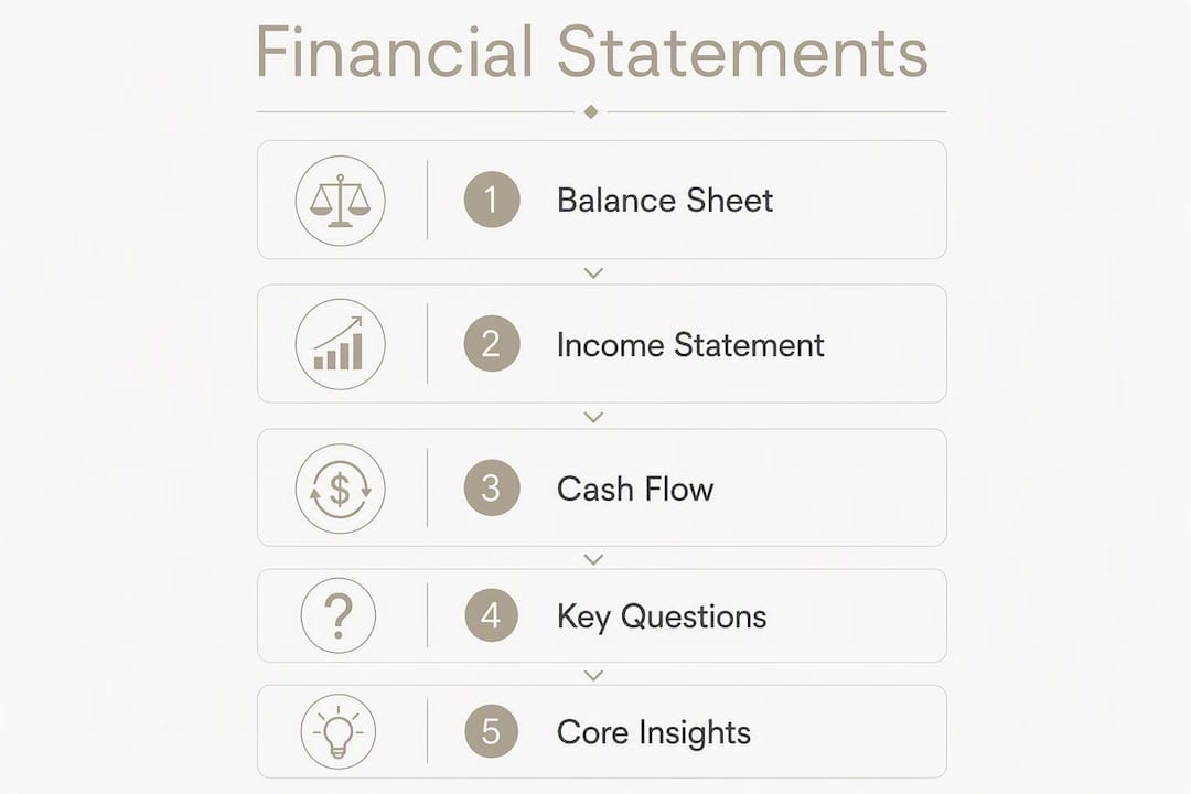
Balance sheet: solvency and liquidity snapshot
The line items that matter most are cash and equivalents, accounts receivable, inventory, total current liabilities, and long-term debt. Net working capital (Current Assets minus Current Liabilities) is your first liquidity signal. Watch for receivables growing faster than revenue — that gap often means customers are paying slower, which is a cash problem disguised as a sales win.
Key formulas:
- Net Working Capital = Current Assets minus Current Liabilities
- Current Ratio = Current Assets / Current Liabilities
- Quick Ratio = (Cash + Short-term Investments + Receivables) / Current Liabilities
Income statement: profitability and margin trends
Focus on gross profit, operating income, and net income — in that order. Gross margin tells you whether the core product economics work. Operating margin shows whether the business can manage its cost structure. Net margin is what's left after everything, including interest and taxes.

Pro Tip: Watch for one-time items buried in operating expenses — restructuring charges, asset write-downs, or litigation settlements. Strip them out before comparing margins year-over-year. A company that "improved" its operating margin by reversing a prior-year charge hasn't actually improved anything.
Cash flow statement: cash quality and sustainability
A business can be profitable on paper yet cash-poor if cash is tied up in receivables or inventory. The reconciliation between net income and operating cash flow is where the truth lives. Free cash flow (Operating Cash Flow minus Capex) is the number that tells you whether the business generates real, spendable cash after maintaining its assets.
| Statement | Core question | Key line items |
|---|---|---|
| Balance sheet | Can it survive a shock? | Cash, receivables, inventory, current liabilities, long-term debt |
| Income statement | Is the model working? | Revenue, gross profit, operating income, net income |
| Cash flow statement | Is the profit real? | Operating cash flow, capex, free cash flow |
Which ratios should you compute first?
The four ratio groups — liquidity, solvency, profitability, and efficiency — each answer a distinct risk question. Liquidity: can the company pay bills this quarter? Solvency: can it survive the next five years? Profitability: is it worth running? Efficiency: is it using assets well? Miss any group and you have a partial picture.
Liquidity ratios
- Current Ratio = Current Assets / Current Liabilities. Above 2.0 is comfortable; below 1.0 is a warning.
- Quick Ratio = (Cash + Receivables) / Current Liabilities. Strips out inventory, which may not convert to cash quickly.
- Cash Ratio = Cash / Current Liabilities. The most conservative measure; useful for distressed-company analysis.
Solvency ratios
- Debt-to-Equity (D/E) = Total Debt / Shareholders' Equity. Context matters enormously here — a D/E of 3.0 is alarming for a retailer and routine for a utility. Always benchmark D/E to the industry.
- Interest Coverage = Operating Income / Interest Expense. Below 2.0 means the company is uncomfortably close to not covering its debt service.
Profitability ratios
- Gross Margin = Gross Profit / Revenue
- Operating Margin = Operating Income / Revenue
- Net Margin = Net Income / Revenue
- ROA = Net Income / Total Assets
- ROE = Net Income / Shareholders' Equity
A deeper treatment of profitability ratios shows how margin and return metrics interact — ROE, for instance, can look strong because of leverage rather than genuine operational performance.
Efficiency ratios
- Inventory Turnover = Cost of Goods Sold / Average Inventory. Low turnover often signals obsolete stock.
- Receivables Turnover = Revenue / Average Receivables. Falling turnover means slower collections.
- Asset Turnover = Revenue / Total Assets. Measures how hard assets are working.
Worked example: Suppose a manufacturer reports $10M revenue, $1.5M net income, $8M current assets, $5M current liabilities, $3M operating cash flow, and $1M capex. Current ratio = 1.6 (amber), net margin = 15% (green), free cash flow = $2M (green). But operating cash flow conversion (Operating Cash Flow / Net Income) = 2.0, meaning cash generation is actually stronger than the income statement suggests — a positive signal that pure margin analysis would miss.
For small companies, prioritize current ratio, free cash flow, and interest coverage. For established firms with stable revenue, add ROE and asset turnover to assess capital efficiency.
How do you run trend, common-size, and variance analysis?
Use trend analysis (horizontal) for momentum, common-size analysis (vertical) for structure, and variance or event analysis for separating one-time effects from recurring ones. Running all three together takes maybe 90 minutes on a spreadsheet and produces a far clearer picture than any single lens.
Trend analysis (horizontal): Calculate the percentage change in each line item across periods. A 12–24 month quarterly window catches momentum without drowning in noise. Year-over-year comparisons handle seasonality. If revenue grows 15% but operating expenses grow 22%, that spread is the story.

Common-size analysis (vertical): Express every income statement line as a percentage of revenue, and every balance sheet line as a percentage of total assets. This normalizes for size and lets you compare a $50M company to a $500M peer on equal footing. A company whose cost of goods sold crept from 55% to 63% of revenue over three years has a structural margin problem, even if absolute revenue grew.
Variance and event analysis: Isolate the effect of a single event — a major contract win, an acquisition, a supply-chain disruption — by comparing pre- and post-event periods. This prevents you from extrapolating a one-time revenue spike into a trend.
Pro Tip: For businesses with seasonal revenue, use rolling 12-month aggregates rather than individual quarters. A single bad December can make Q4 look catastrophic when the trailing year is actually fine. Quarterly reviews reduce the reactive decisions that monthly data noise tends to trigger.
Correlation analysis is worth adding when you suspect a relationship between an external variable (commodity prices, interest rates, a key customer's revenue) and your own financials. It won't prove causation, but it flags dependencies worth stress-testing.
How do benchmarks give your ratios meaning?
A ratio without context is just a number. A current ratio of 1.4 could be excellent for a grocery chain and alarming for a software company sitting on deferred revenue. Benchmarks give ratios meaning by anchoring them to what's normal for the business model, sector, and size.
Four benchmark sources:
- Industry aggregates (SEC filings, Federal Reserve data, trade associations): the most objective comparator, but averages include weak performers.
- Historical company trends: your own prior periods. Useful for spotting deterioration even when absolute levels look acceptable.
- Direct peers: companies of similar size, model, and geography. Harder to assemble but most relevant.
- Rule-of-thumb thresholds: quick filters, not verdicts. Current ratio above 1.5, gross margin above 40% for software, D/E below 2.0 for most non-financial companies.
| Metric | Rule-of-thumb | Industry average (general) | Top quartile |
|---|---|---|---|
| Current ratio | Generally acceptable | Typical range | Stronger liquidity |
| Gross margin | Varies by sector | Typical range for non-commodity industries | Higher margin levels |
| Debt-to-equity | Generally low leverage | Typical industry range | Low leverage |
| FCF margin | Positive | Moderate range | Higher levels |
Capital-intensive businesses (manufacturing, utilities, real estate) carry higher D/E and lower asset turnover by design. Asset-light businesses (software, consulting) should show higher margins and faster turnover. Applying a generic D/E threshold to a capital-intensive firm produces a false alarm; applying a software-company margin benchmark to a manufacturer sets an impossible standard.
How to run a complete financial health check, step by step
This is a repeatable workflow you can complete in a single session. The output is a scorecard with category scores and a prioritized action list.
- Gather data. Pull the last three annual reports (10-K) or quarterly filings (10-Q) from SEC EDGAR, the company's investor relations page, or your accounting system. Add bank statements for cash reconciliation.
- Reconcile cash and profit. Compare net income to operating cash flow for each period. Flag any year where the gap exceeds 20% of net income.
- Compute the liquidity set. Current ratio, quick ratio, cash ratio.
- Compute the solvency set. D/E ratio, interest coverage.
- Compute the profitability set. Gross margin, operating margin, net margin, ROE, ROA.
- Compute the efficiency set. Inventory turnover, receivables turnover, asset turnover.
- Run horizontal trend analysis. Calculate year-over-year and quarter-over-quarter changes for revenue, gross profit, operating income, and operating cash flow.
- Run vertical common-size analysis. Express income statement lines as a percentage of revenue; balance sheet lines as a percentage of total assets.
- Benchmark each ratio. Compare to industry averages, historical company levels, and rule-of-thumb thresholds.
- Score each category. Assign green/amber/red to liquidity, solvency, profitability, and efficiency.
- Produce a scorecard. Summarize category scores and compute an overall health band.
- Build an action plan. List the top three issues by impact, assign owners and timelines.
Sample scorecard layout:
| Category | Score | Band | Priority action |
|---|---|---|---|
| Liquidity | — | Amber | Accelerate receivables collection |
| Solvency | — | Green | Monitor D/E at next refinancing |
| Profitability | 10/20 | Amber | Review pricing and COGS structure |
| Efficiency | 8/20 | Red | Reduce inventory days outstanding |
| Overall | 50/— | Amber | Focus on efficiency and profitability |
A composite scoring approach that weights each dimension reveals which component is the binding constraint. Improving a single weak area typically moves the overall score more than marginal gains in areas already performing well.
For investors, run the full check annually and a lighter version (liquidity and cash flow only) each quarter. For business owners, a quarterly full check is the right cadence — monthly reviews are useful for cash monitoring but tend to produce reactive decisions when the data is noisy.
What are the most common red flags, and how do you fix them?
The five red flags that most reliably signal worsening financial health: negative operating cash flow, receivables growing faster than revenue, eroding gross margins, rising leverage, and shrinking liquidity. The US Chamber of Commerce reports that 60% of small businesses report cash-flow management problems — which means that most of these red flags are common, not exceptional.
| Red flag | Practical fix | Lead time |
|---|---|---|
| Negative operating cash flow | Tighten payment terms; accelerate invoicing | 30–90 days |
| Receivables outpacing revenue | Enforce collection policies; offer early-pay discounts | 30–60 days |
| Eroding gross margins | Review pricing, renegotiate supplier contracts | 60–— days |
| Rising D/E ratio | Refinance short-term debt; pause non-essential capex | 90–— days |
| Current ratio below 1.0 | Draw on credit facility; liquidate slow-moving inventory | Immediate |
Prioritization rule: fix high-impact, low-effort issues first. Accelerating collections costs almost nothing and can recover weeks of cash runway. Refinancing debt takes months and requires lender cooperation. Start with the cash levers.
Pro Tip: When liquidity runway drops below three months of operating expenses, stop optimizing and start contingency planning. That means contacting your bank before you need the credit line, not after. Outside advisors — a CFO consultant or turnaround specialist — are worth engaging at this threshold, not after the crisis is obvious.
How Oracleinvestments maps to the financial health checklist
Oracleinvestments automates several of the most time-consuming steps in the checklist above. The app scores over 260 stocks across profitability, valuation, and financial health fundamentals, so investors skip the manual ratio computation and go straight to interpretation.
Checklist steps Oracleinvestments accelerates:
- Steps 3–6 (ratio computation): Ratios are pre-computed and displayed as a composite score, color-coded by health band.
- Step 9 (benchmarking): Scores are calibrated against fundamentals, so you see relative strength without building a peer table manually.
- Step 11 (scorecard): The app's scoring interface functions as a ready-made scorecard, updated automatically as new filings are processed.
- Step 12 (action plan): Side-by-side company comparisons let investors quickly identify which holding needs attention and which is performing.
Use case — investor monitoring multiple holdings: An investor tracking a portfolio of 12 stocks can scan all 12 health scores in minutes, flag the two showing amber or red signals, and drill into those filings rather than reviewing every company from scratch. The portfolio tracking tools built into the app support exactly this kind of triage workflow.
Use case — small-business owner: A business owner who has run the manual checklist once can use the app's stock-comparison features to benchmark their sector's publicly traded peers, giving them a real-world reference point for what healthy margins and leverage look like in their industry.
Oracleinvestments is an analysis and scoring tool, not a tax or legal advisor. Always verify ratio inputs and scorecard outputs against the original SEC filings or audited financial statements before making material decisions.
How does financial analysis connect to strategy and risk management?
Financial health analysis is most useful when it feeds directly into decisions, not when it sits in a spreadsheet. The connection between diagnostic findings and strategic choices is where most investors and owners leave value on the table.
Linking findings to strategic decisions: A company with strong free cash flow and low leverage has optionality — it can acquire, invest in R&D, or return capital. A company with thin margins and rising debt has no such optionality; every strategic choice must be filtered through a cash-preservation lens first. The financial health score, in this sense, defines the strategic menu.
Risk management integration: Map each red flag to a specific risk category. Negative operating cash flow is a liquidity risk. Rising D/E is a solvency risk. Eroding margins are a competitive risk. Each category calls for a different response: liquidity risks require immediate cash management; solvency risks require capital structure decisions; competitive risks require operational or pricing changes. Treating them as a single undifferentiated "financial problem" leads to unfocused fixes.
Qualitative factors that numbers miss: Management quality, customer concentration, and contract timing all affect financial health in ways that ratios don't capture directly. A company with 60% of revenue from one customer may show excellent margins today and catastrophic cash flow next year if that contract isn't renewed. External factors — interest rate shifts, commodity price swings, regulatory changes — can move key ratios faster than any operational fix. Build a simple scenario table: what happens to free cash flow if revenue drops 15%? What if interest rates rise 200 basis points? Those two scenarios cover most of the macro risks that blindside otherwise healthy businesses.
Review cadence as a risk control: Structured quarterly reviews, rather than reactive monthly check-ins, reduce the noise-driven decisions that erode strategic clarity. Think of the health check the way you'd think of a medical physical: do it on a schedule, record the measurements, and use the trend to update the plan — not just to react to the latest reading.
Key Takeaways
A complete financial health analysis requires evaluating liquidity, solvency, profitability, and efficiency together — no single ratio tells the full story, and the cash flow statement is the most reliable place to start.
| Point | Details |
|---|---|
| Start with cash flow | Reconcile operating cash flow to net income first; profit without cash is a warning sign. |
| Use all four ratio groups | Liquidity, solvency, profitability, and efficiency each answer a distinct risk question. |
| Benchmark every ratio | A ratio without industry or historical context is just a number; always compare to peers and prior periods. |
| Prioritize the binding weakness | Improving the single weakest area moves the composite score more than gains in already-strong areas. |
| Oracleinvestments speeds the process | The app pre-computes ratios and scorecards for 260+ stocks, cutting manual analysis time and supporting portfolio-level triage. |
What most analysts get wrong about financial health
The most common mistake isn't using the wrong formula. It's over-indexing on a single metric and treating it as a verdict. A business with a 25% net margin and a current ratio of 0.8 is not healthy — the margin is real, but the liquidity problem can kill the company before the profitability ever pays off. Profit margin signals viability; liquidity dictates survival. When they conflict, liquidity wins.
Three heuristics worth keeping:
1. Prioritize cash conversion over reported earnings. A company that consistently converts 90%+ of net income to operating cash flow is almost always more durable than one reporting higher earnings with weaker conversion. The free cash flow number is harder to manipulate than net income and closer to what actually funds operations.
2. Use rolling 12-month windows for volatile businesses. A single bad quarter in a seasonal business looks catastrophic in isolation. Rolling 12-month aggregates smooth that noise and reveal whether the underlying trend is actually deteriorating or just cycling.
3. Prefer the trend of margins over single-quarter spikes. A one-quarter margin improvement driven by a large one-time contract tells you almost nothing about the business's trajectory. Three consecutive quarters of margin expansion, even modest, is a meaningful signal.
Two cautionary patterns: A retailer with rising gross margins but falling inventory turnover looks profitable on the income statement while quietly building an inventory problem that will hit cash flow six months later. And a company with strong ROE that's entirely explained by high leverage — not operational performance — looks like a winner until interest rates move or refinancing becomes difficult. The margin of safety concept applies here: the more a company's apparent health depends on favorable conditions holding, the less real that health is.
Check the qualitative signals too. Management tone in earnings calls, customer concentration above 30%, and contract renewal timing are the factors that make a ratio-based analysis look wrong in hindsight. Numbers describe what happened; qualitative factors often explain what's coming.
Oracleinvestments puts the scorecard in your pocket
Running a manual financial health check takes hours. Oracleinvestments compresses the ratio computation, benchmarking, and scorecard steps into a single screen, giving investors an instant read on any of 260+ stocks scored across profitability, valuation, and financial health fundamentals.

What you get with Oracleinvestments:
- Instant composite health scores, color-coded by band, so you see green/amber/red without building a spreadsheet
- Side-by-side company comparisons that surface undervalued stocks and flag deteriorating fundamentals before they become obvious
- Real-time portfolio tracking with alerts, so a shift in a holding's health score reaches you before you read about it in the news
The app is available on the Apple App Store. If you want to run your first company scan today, start at the Oracle Investments landing page and see how the scorecard maps to the checklist you just worked through.
Primary sources and further reading
Authoritative external resources:
- Consumer Financial Protection Bureau — Financial Well-Being Score: Score-band framework useful for interpreting composite health scores and personal finance benchmarks.
- Investopedia — What's the Best Measure of a Company's Financial Health?: Covers the case for grouped ratio analysis and the limits of single-metric evaluation.
- US Chamber of Commerce — Financial Metrics That Reveal Your Business's True Health: Practical guidance on operating cash flow, small-business cash management, and review cadence.
- Harvard Business School Online — How to Determine the Financial Health of Your Company: Framework-level treatment of financial statement analysis for business leaders.
- Wisconsin DFI — Financial Wellness Checklist: A structured personal finance checklist covering spending plans, insurance, debt, savings, and retirement.
Oracleinvestments resources:
| Resource | What it covers |
|---|---|
| How to Read a Value Rating | Interpreting Oracle's composite score in under a minute |
| Income Statement Analysis | Step-by-step checklist for extracting signals from income statements |
| Debt to Equity Ratio Guide | Leverage metrics explained for investors |
| Return on Invested Capital | Advanced return and efficiency metrics |
| Best Portfolio Analysis Tools | Tool selection for tracking and automating health checks |