
The Buffett Indicator divides total stock market value by nominal GDP to show whether stocks are cheap or expensive relative to the economy that actually generates their earnings. The practical takeaway: readings near the 70 to 90 percent area suggest reasonable value, around 90 percent is roughly fair, a range above that flags an elevated market, and very high levels count as extreme. It's a long-term valuation gauge for setting allocation risk, not a tool for timing next month's moves.
TL;DR:
- A Buffett Indicator reading above 115% suggests the market is overpriced, while below 75% indicates a potential undervaluation, based on long-term trends.
- Structural factors like global revenue, buybacks, and differences between GNP and GDP can cause the ratio to appear artificially high or low over time.
- Investors should treat the ratio as a risk regime indicator and combine it with company-specific fundamentals rather than using it as a precise buy or sell trigger.
- Regularly reviewing de-trended or z-score versions helps account for structural market changes and avoids misinterpreting extreme raw percentage levels.
- Trusted sources for calculating or tracking the Buffett Indicator include the Federal Reserve's Z.1 data, the BEA for GDP figures, and broad market proxies like the Wilshire 5000.
Table of Contents
- Buffett Indicator Explained: What It Is and How the Formula Works
- What Do Historical Buffett Indicator Benchmarks Mean?
- Where the Buffett Indicator Falls Short
- How to Use the Buffett Indicator in Your Portfolio
- Where to Check the Buffett Indicator Right Now
- A Worked Example: Calculating the Buffett Indicator Yourself
- A Candid Take on the Buffett Indicator
- Turning the Buffett Indicator Into Action With Oracle Investments
- Primary Sources for Verifying Buffett Indicator Data
- Sources
Buffett Indicator Explained: What It Is and How the Formula Works
The formula is simple: (Total market capitalization ÷ nominal GDP) × 100. Divide the combined value of publicly traded stocks by the size of the economy, multiply by 100, and you get a percentage that shows how expensive the stock market has become relative to the goods and services the country actually produces.
The logic behind pairing these two numbers is what makes the ratio useful. Stock prices reflect investors' collective bet on future corporate profits. GDP measures the real economic output those profits ultimately come from. When market value grows much faster than GDP for a sustained stretch, prices are increasingly running on optimism rather than output, and that gap tends to matter eventually.
Warren Buffett popularized this comparison in a 2001 Fortune essay, calling it "probably the best single measure of where valuations stand at any given moment." Analysts adopted it because it requires no forecasting, no earnings estimates, and no assumptions about interest rates.
The formula breaks down into three working pieces:
- Numerator: total market capitalization of publicly traded U.S. stocks
- Denominator: nominal (not inflation-adjusted) GDP for the same period
- Output: a percentage compared against historical bands to judge relative valuation
What Do Historical Buffett Indicator Benchmarks Mean?
Get it near 200%, he wrote, and "you are playing with fire." Those two anchors still frame most of the interpretive bands analysts use today.
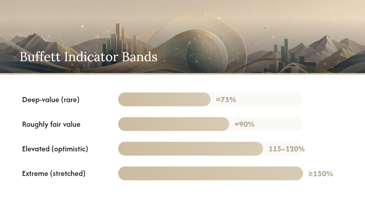
A more granulated version of that framework looks like this:
- Around 75%: deep-value territory, historically rare and often tied to recession bottoms
- Around 90%: roughly fair value by long-run historical standards
- 115% to 120%: elevated, suggesting the market has priced in optimistic growth
- 150% or higher: extreme, a zone the market has occupied for extended stretches in recent cycles
Statistic Callout: During the dot-com peak in 2000, the ratio pushed well past 100% before the subsequent crash. By the 2009 trough, it had collapsed to roughly a third of that level, one of the cheapest readings in decades. By contrast, the Advisor Perspectives tracker has shown the ratio sitting well above its historical trendline for most of the 2020s.
That last point matters more than the raw bands suggest. Because the ratio has drifted structurally higher over decades, comparing today's reading against a fixed band from the 1970s risks a false alarm. Analysts increasingly de-trend the series, subtracting a long-run regression line or converting to a z-score, to see how far a reading sits from its own historical norm rather than an absolute number. A reading of 140% might look extreme against 1990s history but only moderately stretched against a trendline that has been rising for 40 years.
Where the Buffett Indicator Falls Short
The single biggest structural flaw: American companies increasingly earn revenue overseas. When a company's stock trades on U.S. exchanges but half its sales come from Asia or Europe, its market cap grows with global demand while the GDP denominator only measures domestic output. That mismatch alone can push the ratio structurally higher over time, independent of any actual overvaluation.
Three other distortions worth knowing before you trust a single reading:
- Buybacks and IPOs. Large-scale share repurchases and blockbuster IPOs can shift aggregate market cap sharply without any change in underlying economic output. A wave of buybacks inflates the numerator while GDP sits still.
- GDP vs. GNP. Buffett's original essay referenced GNP, which includes income from overseas investments; most modern trackers use GDP instead. The two series move differently, which is one reason today's readings aren't perfectly comparable to Buffett's 2001 benchmarks.
- Numerator choice. Full-cap Wilshire 5000, Fed Z.1 lines, and float-adjusted variants each produce a slightly different percentage from identical market conditions, so the "same" indicator can read differently across two reputable sources.
None of this makes the ratio useless. It does mean the indicator can sit at an extreme reading for years without triggering a correction, and treating a single percentage as a hard trigger for a portfolio move is a mistake the ratio itself warns against.
Pro Tip: Never judge a single reading in isolation. Pull up the de-trended or z-score version alongside the raw percentage. A raw 145% might sound alarming, but if the trendline has drifted up because of structural globalization effects, the de-trended number could tell a calmer story.
How to Use the Buffett Indicator in Your Portfolio
Treat the ratio as a regime signal, something that adjusts your risk budget over months or years, never a trigger for a single trade.
- Set rebalancing thresholds in advance. Decide before you look at the current reading, not after, what percentage crossing a band change (say, moving from "fair" into "elevated") means for your equity allocation. Predetermined rules stop you from rationalizing a reaction to a scary headline number.
- Tilt rather than exit. When the ratio sits in extreme territory, consider a modest tilt toward value and quality factors, or trim a few percentage points of equity exposure into cash or short-duration bonds, instead of abandoning stocks outright. History shows extreme readings can persist for years.
- Cross-check with company-level fundamentals. A market-wide valuation signal says nothing about whether an individual stock is cheap. Layer in owner earnings calculations, a standard P/E, and the PEG ratio before deciding a specific position is overpriced just because the aggregate market looks stretched.
- Widen your risk lens. Pair the Buffett Indicator with something like the Altman Z score for balance-sheet risk or a straightforward price to book ratio for asset-heavy sectors, so you're not leaning on one macro number to make every call.
The goal isn't to predict next quarter's move. It's to make sure your equity exposure roughly matches the level of macro risk you're actually taking on.
Where to Check the Buffett Indicator Right Now
For raw data, three sources anchor almost every credible reading: the Federal Reserve's Z.1 Financial Accounts for market-cap lines, the Bureau of Economic Analysis for nominal GDP, and the Wilshire 5000 for a broad market-cap proxy.
For pre-built charts and commentary, a few trackers stand out:
- Advisor Perspectives (dshort) publishes regular updates with trendline-adjusted comparisons and explicit notes on timing lags.
- MarketCapLens offers current-year charting that breaks down which numerator series it's using.
- MacroMicro provides interactive historical charts for readers who want to compare cycles side by side.
Before trusting any chart, check two things: the date of the GDP figure it's using, and whether it's applying concurrent GDP or a lagging print. A tracker using a GDP estimate from the current quarter will read differently than one anchored to the last confirmed BEA release, even with identical market-cap data.
A Worked Example: Calculating the Buffett Indicator Yourself
Here's how to reproduce a reading with a spreadsheet and two numbers.
- Pull the market-cap figure. Find the Wilshire 5000 Full Cap Index value for your chosen quarter, or use the Fed Z.1 nonfinancial and financial corporate equity lines added together.
- Pull the matching GDP figure. Use the BEA's nominal GDP for that same quarter from FRED. If the concurrent quarter hasn't been released yet, use the most recent confirmed figure and note the lag.
- Divide and convert. Market cap ÷ GDP, then multiply by 100. If market cap sits at $50 trillion and nominal GDP for the same period is $28 trillion, the ratio comes out to roughly 179%, solidly in extreme territory by the historical bands above.
- Adjust for your numerator choice. Swapping in a float-adjusted market-cap series instead of full-cap will shave a few points off the result, so label your spreadsheet with which series you used before comparing it to someone else's chart.
That's the entire calculation. The hard part isn't the math, it's making sure your numerator and denominator are actually measuring the same moment in time.
A Candid Take on the Buffett Indicator
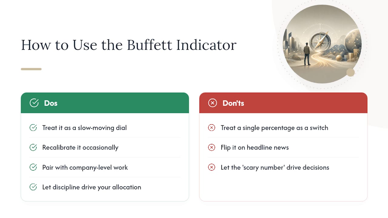
The ratio earns its reputation for a good reason: it's one of the few valuation tools that doesn't require you to trust anyone's earnings forecast. But treating a single percentage as a green light or red light is where investors get into trouble.
Use it the way it was designed to be used: as a slow-moving dial on your risk budget, recalibrated occasionally, not a switch you flip on headline news. Pair the macro signal with real company-level work, and let discipline, not the scary number of the week, drive your allocation.
— Matt
Turning the Buffett Indicator Into Action With Oracle Investments
Reproducing this calculation by hand every quarter works fine for a hobby project, but it's slow when you're also trying to figure out which individual stocks are actually worth buying at a given valuation regime. Oracleinvestments scores over 260 stocks on profitability, valuation, and financial health, so once the market-wide reading tells you the overall environment looks stretched or cheap, you can immediately drill into specific companies rather than starting from scratch.

The app runs owner-earnings calculations automatically, a method favored by Buffett, and lets you compare companies side by side instead of pulling numbers from multiple spreadsheets. Combine a regime-level signal like the Buffett Indicator with company-level screens inside one dashboard, and portfolio tracking updates as your allocation shifts. Start with Oracle and run your next valuation check in seconds instead of an afternoon.
Primary Sources for Verifying Buffett Indicator Data
To confirm any reading yourself, go straight to the source data rather than a secondhand chart.
- Bureau of Economic Analysis: publishes the nominal GDP figures used as the denominator.
- Federal Reserve Z.1 / FRED: supplies market-cap lines and the GDP series in one searchable database.
- Wilshire 5000: the standard broad market-cap proxy most trackers use as the numerator.
- Advisor Perspectives and MarketCapLens: provide regularly updated charts with methodology notes attached.
This article is general information, not a substitute for advice from a qualified financial advisor. Consult a qualified financial professional about your own circumstances before acting on anything here.
Sources
Two providers rarely produce the exact same number, and the reason comes down to which numerator they use and how they handle timing lags.
- Buffett indicator — Wikipedia
- Buffett Valuation Indicator: June 2026 - dshort
- Fortune — The Buffett Indicator, explained by the Oracle of Omaha
- FRED – GDP series
That timing mismatch explains why a chart updated today might still be dividing by a GDP figure from months ago. Reproducible readings depend on knowing exactly which numerator and which GDP vintage a source used, not just the headline percentage.